


Most advice about Power BI for business is rubbish. It tells you to pick a licence, connect a few data sources, and start building dashboards. That's how you end up with an ungoverned reporting estate, angry auditors, and executives arguing over which version of revenue is real.
Power BI isn't a toy for replacing Excel charts. It's an enterprise analytics platform wired into your Microsoft estate, your security model, your data quality, and your operating discipline. Your team can absolutely build something quickly. That isn't the same as building something safe, repeatable, or trustworthy.
We often see clients fail when they buy Power BI expecting convenience and get architecture instead. The damage shows up later. Conflicting semantic models. Workspaces nobody owns. Refresh failures nobody can explain. KPI packs that look polished and say nothing useful.
Power BI Is Not Just Another Dashboard Tool
Microsoft doesn't position Power BI as a casual charting add-on. It presents it as a unified self-service and business intelligence platform within the Power Platform ecosystem on the official Power BI product page. That wording matters. It tells you what Microsoft built. It also tells you why so many deployments go sideways.
Your users see a report canvas. Your architects should see an operating model.
If you treat Power BI for business like a prettier version of spreadsheet reporting, you'll create the usual mess. Each department builds its own logic. Nobody agrees on definitions. Sales has one margin figure, finance has another, operations has a third, and leadership gets all three in the same week. The software didn't fail. Your governance did.
The real product is control
Power BI sits inside a wider platform. That means your reporting layer is tied to identity, permissions, data movement, workspace design, and lifecycle control. Self-service sounds attractive until every team self-serves a different version of the truth.
Power BI projects rarely collapse because a visual looked wrong. They collapse because nobody designed who owns the data, who defines the measures, and who approves change.
That's why comparisons with other BI tools only help if they go beyond feature lists. If you're still evaluating platforms, this breakdown of the differences between Tableau, Looker, Power BI is useful because it frames trade-offs rather than pretending every tool suits every operating model.
What your team usually underestimates
A proper Power BI estate needs discipline in places business sponsors often ignore:
- Data model ownership. Someone must own shared definitions, not just report layouts.
- Workspace boundaries. If everyone can publish anywhere, report sprawl starts immediately.
- Change control. A “small tweak” to a measure can break board reporting.
- Governed rollout. Department pilots often harden into enterprise dependencies without enterprise controls.
If you want a more grounded view of what a Microsoft reporting stack requires, our write-up on Microsoft business intelligence with Power BI goes deeper into the operational side.
The blunt version is simple. Buying Power BI licences is a procurement step. Deploying Power BI for business is an architecture decision.
The Discipline Required for Meaningful KPIs
The fastest way to expose a weak Power BI deployment is to ask one question. “What exactly is this KPI measuring against?”
Teams often go quiet there.
Microsoft's own guidance for the Power BI KPI visual is clear. A KPI visual needs a base measure, a target measure or value, and a threshold or goal. Microsoft Learn also shows the visual depends on the right indicator, target, and trend fields to work correctly. That alone should kill the fantasy that KPI reporting is just drag, drop, and colour formatting.
A KPI without target logic is decoration
In regulated sectors, a KPI isn't a number on a screen. It's a measurable statement about performance against an agreed objective. If your finance, healthcare, or energy teams can't point to the source of the target, the owner of the threshold, and the trend logic behind the visual, then you don't have a KPI. You have decoration.
We often see clients fail when business sponsors ask for “a dashboard for the board” before anyone has defined target ownership. The report team then improvises. They pull a current value from one system, a target from an email thread, and trend data from a manual export. The final visual looks convincing and collapses the moment someone asks for auditability.
Microsoft's own design tells you what matters
The KPI visual is built around measurable goals, not generic summaries. Microsoft Learn also shows it can be sorted by fiscal month and compared against last-year performance. That's operational reporting. That's performance management. That's not the same thing as sticking a number card on a page and calling it insight.
A disciplined KPI design usually needs:
- A governed base measure that everyone accepts.
- A target definition with a named business owner.
- Trend data that supports period comparison, not static snapshots.
- Exception logic so users can see when performance moves outside agreed tolerance.
Practical rule: If your team can't explain the target and trend behind a KPI in one minute, the visual shouldn't be in production.
This is the point where many organisations realise they've outgrown ad hoc reporting habits. If that sounds familiar, our piece on signs your business has outgrown spreadsheets will probably feel uncomfortably familiar.
The board doesn't care about your visual polish
Board reporting needs consistency more than beauty. Executives need to know whether the metric is on track, what the target was, who approved it, and whether the trend tells a coherent story. If your KPI pack can't answer those questions, your problem isn't design. It's architecture.
That's why Power BI for business succeeds only when teams define KPI semantics before they build visuals. Do it the other way round and you'll spend months redesigning reports that should never have been approved.
Your Architectural and Integration Minefield
The documentation says Power BI is a cloud-based analytics platform, supports interactive reports, connects to live data, and is also available as part of Microsoft Fabric in the Power BI service description. Fine. Reality is harsher. Every one of those integration points creates another place for your reporting estate to break.
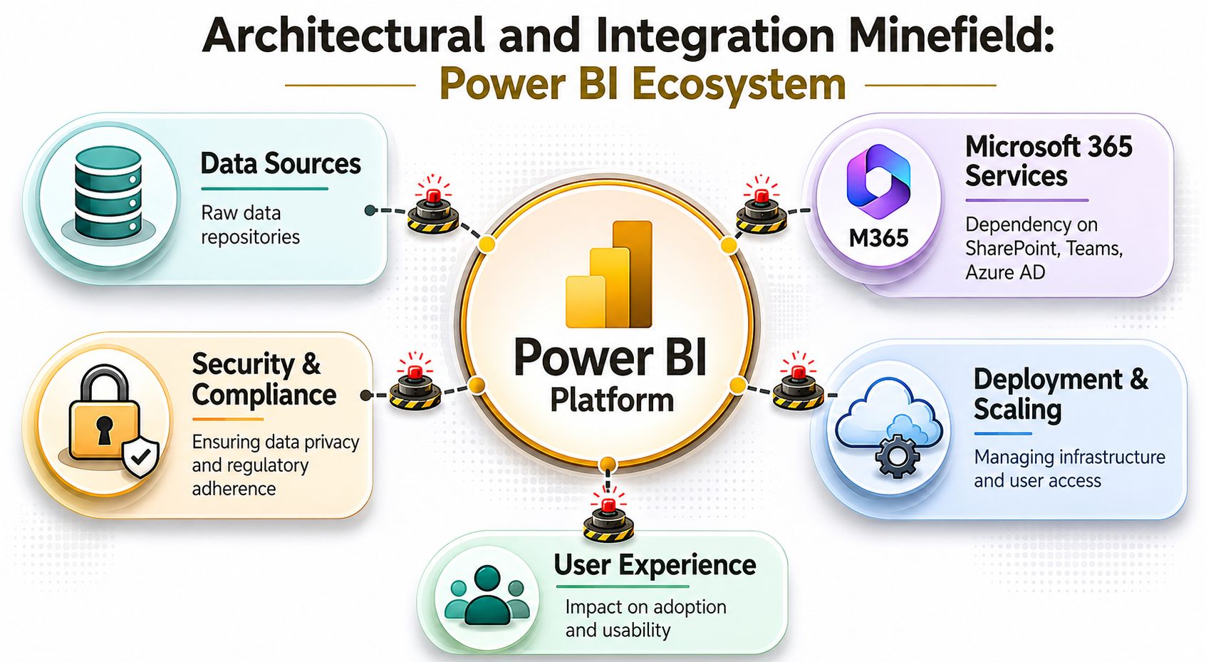
Your team often treats Power BI as a thin presentation layer. That's the first serious mistake. Once reports depend on live or regularly refreshed data across Microsoft 365 services, on-premises systems, cloud platforms, and shared workspaces, you're no longer building dashboards. You're operating a distributed data access model.
Source systems don't forgive bad assumptions
A report can work perfectly in test and fail under production behaviour. That happens because test conditions are usually polite. Production users aren't. They open reports at the same time, demand more history, add more filters, and expect refreshes to land before morning meetings.
We often see clients fail when they ignore source-system constraints. The result is predictable:
| Failure point | What teams assume | What actually happens |
|---|---|---|
| Data source refresh | “It refreshed in dev, so we're fine” | Shared usage increases pressure on refresh windows and source contention |
| Workspace growth | “We'll tidy it later” | Report sprawl creates duplicate semantics and unclear ownership |
| Cross-team distribution | “We just need to share it wider” | Permission complexity grows faster than most teams can manage |
| Fabric and service adoption | “It's only a reporting tool” | Capacity and governance decisions become architecture decisions |
Microsoft's own service description makes the chain reaction obvious. More users and larger models create more refresh pressure. That pressure increases contention on client machines and underlying sources. Then come failed refreshes, stale reports, and inconsistent governance. The software is doing exactly what the architecture allows.
Integration creates blast radius
Power BI doesn't live alone. It inherits risk from everything around it.
- Identity dependencies. If your Entra ID access model is inconsistent, service access and sharing controls become brittle.
- Microsoft 365 coupling. SharePoint, Teams, and other connected services widen the estate you need to govern.
- Capacity planning. Once Fabric enters the picture, you're making platform decisions, not just report decisions.
- Lifecycle gaps. Reports often outlive the people who built them, which leaves orphaned logic in production.
For organisations trying to prepare wider data estates for AI use, this problem gets worse, not better. Our article on architecting data as your constant in a world of variable AI gets into why weak reporting architecture poisons downstream automation and AI initiatives.
If your source systems, identities, and governance model aren't stable, Power BI will expose the weakness. It won't hide it.
The minefield isn't optional
You don't get to skip architecture because the reporting layer looks approachable. Once Power BI for business spreads beyond a single team, every shortcut becomes operational debt. Most organisations only notice that debt when the board pack is late, a refresh fails, or two departments publish contradictory metrics with equal confidence.
The Inevitable Performance Cliff and Scaling Risks
Performance problems in Power BI rarely arrive politely. You don't get a gentle slowdown and a calm warning. You get a model that was “mostly fine” last month and suddenly takes forever to refresh, render, or even open.
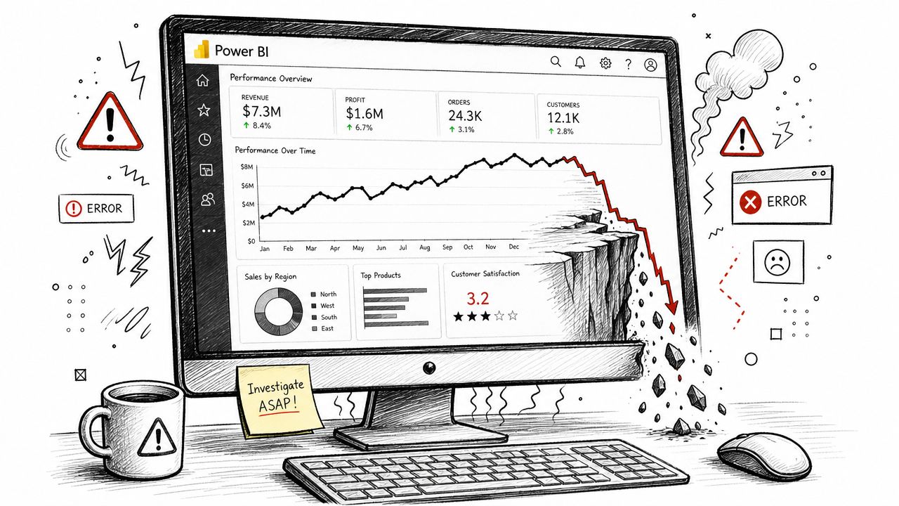
Microsoft's Power BI Report Server system requirements list a bare minimum of 1 GB RAM and a 1.4 GHz x64 CPU. That's technically useful and operationally misleading. It tells you what may start, not what will perform under enterprise reporting load. Real-world guidance commonly points to 16 GB to 32 GB RAM, 8+ cores, and SSD storage for serious desktop work, especially when Import Mode models and complex visuals push memory use hard.
The first bottleneck is usually the analyst laptop
We often see DIY teams fail before they publish anything important. An analyst works on a machine that can “run Power BI” but can't handle a growing model reliably. The model bloats, rendering slows, refreshes drag, and the team starts taking smaller extracts just to keep moving. That doesn't solve the problem. It hides it.
Common symptoms show up in a familiar order:
- Long load times. Desktop opens slowly and previews crawl.
- Painful visual interaction. Slicers lag, page changes hesitate, and developers stop testing properly.
- Refresh workarounds. Teams reduce data scope instead of fixing the model.
- False confidence. Management sees published reports and assumes the platform is healthy.
That last point causes the most damage. Once users depend on those reports, fixing the model gets harder politically and technically.
Scaling multiplies weak design
Bad DAX, oversized imports, and sloppy relationships don't stay local to one PBIX file. They become service problems once refresh schedules, shared workspaces, and broader distribution kick in. Then your estate starts competing for compute, refresh windows, and source responsiveness.
A lot of the same operational lessons show up in broader Microsoft 365 estates. We've seen similar failure patterns in migration and content-heavy platforms, which is why our guide to SharePoint migration performance issues often resonates with teams wrestling with Power BI scale as well.
Here's a practical explainer worth watching before you let anyone tell you performance tuning can wait until later:
What to do before the cliff edge
Don't guess. Force your team to answer these questions early:
- Can analyst workstations handle realistic model sizes?
- Have you tested refresh behaviour under shared usage, not solo development?
- Does the model design reduce memory pressure, or just move it around?
- Who owns performance tuning once reports become business-critical?
Ollo verdict: If your estate matters to more than one department, capacity planning isn't optional. Treat desktop specs, model discipline, and refresh design as first-class architecture concerns or accept that performance failure is coming.
Navigating the Governance Gauntlet for Regulated Business
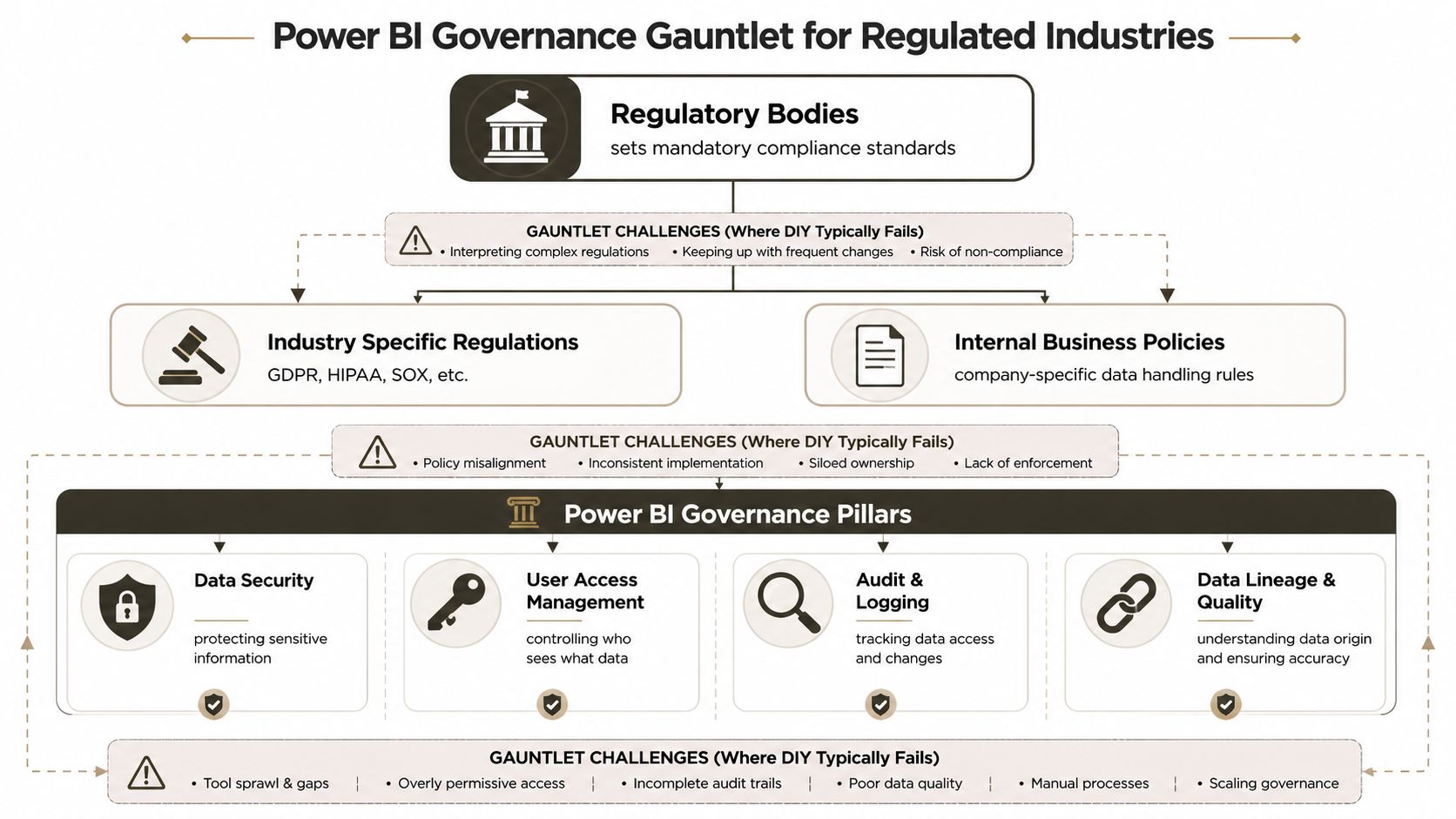
Most Power BI failures in regulated organisations aren't visual failures. They're governance failures that happened to surface through reporting.
Microsoft's own accessibility guidance for creating accessible reports in Power BI is more revealing than is commonly understood. It explicitly calls out keyboard navigation, screen-reader compatibility, high-contrast support, Show Data tables, 4.5:1 contrast, and alt text. If your team can't meet those documented design requirements, don't tell yourself they'll somehow get row-level security, tenant governance, and auditable reporting right.
Accessibility failure is a governance warning sign
Accessibility isn't a side quest for design teams. It's proof of whether your reporting discipline is real. A report with poor contrast, missing alt text, and broken keyboard flow tells me the team built for speed, not control. That mindset usually infects everything else.
We often see clients fail when they confuse permissioning with governance. Giving access to a workspace isn't governance. Publishing a certified-looking report isn't governance. Governance means your organisation can explain who can see what, why they can see it, where the data came from, and how changes are tracked.
The controls that actually matter
For regulated Power BI for business use, these are the essential requirements:
- Workspace design. If ownership is vague, security and lifecycle control will be vague too.
- Row-level security. Sensitive reporting can't rely on trust or informal filtering.
- Auditability. You need evidence of access, change, and lineage, not verbal reassurance.
- Semantic consistency. If multiple teams define the same metric differently, governance has already failed.
A simple contrast helps:
| Weak practice | Governed practice |
|---|---|
| Shared publishing with loose ownership | Named owners and controlled deployment paths |
| Report-specific logic everywhere | Reused semantic definitions with approval |
| Manual access decisions | Structured access model tied to business roles |
| Accessibility treated as optional | Accessibility built into report standards |
Your regulator won't care that the dashboard looked good in a steering meeting. They'll care whether access, lineage, and reporting controls were defensible.
Governance is where DIY usually breaks
This is the uncomfortable truth. DIY teams often manage to build reports. They struggle to operate a governed reporting platform. Tenant settings, data sharing controls, row-level security patterns, report certification, and audit expectations all demand discipline most departmental teams don't have time to build.
If your organisation is already thinking about broader policy, access control, and AI oversight, our guide to Microsoft 365 AI governance is relevant because the same control failures repeat across the estate.
The problem isn't that Power BI is too hard. The problem is that regulated reporting demands grown-up governance, and most Power BI projects are started like side projects.
Migration Anti-Patterns from Real-World Failures
Power BI migrations fail long before the first dataset refresh breaks. They fail at the planning stage, when someone decides the old reporting estate is good enough to copy across with a new logo and a Microsoft badge on top.
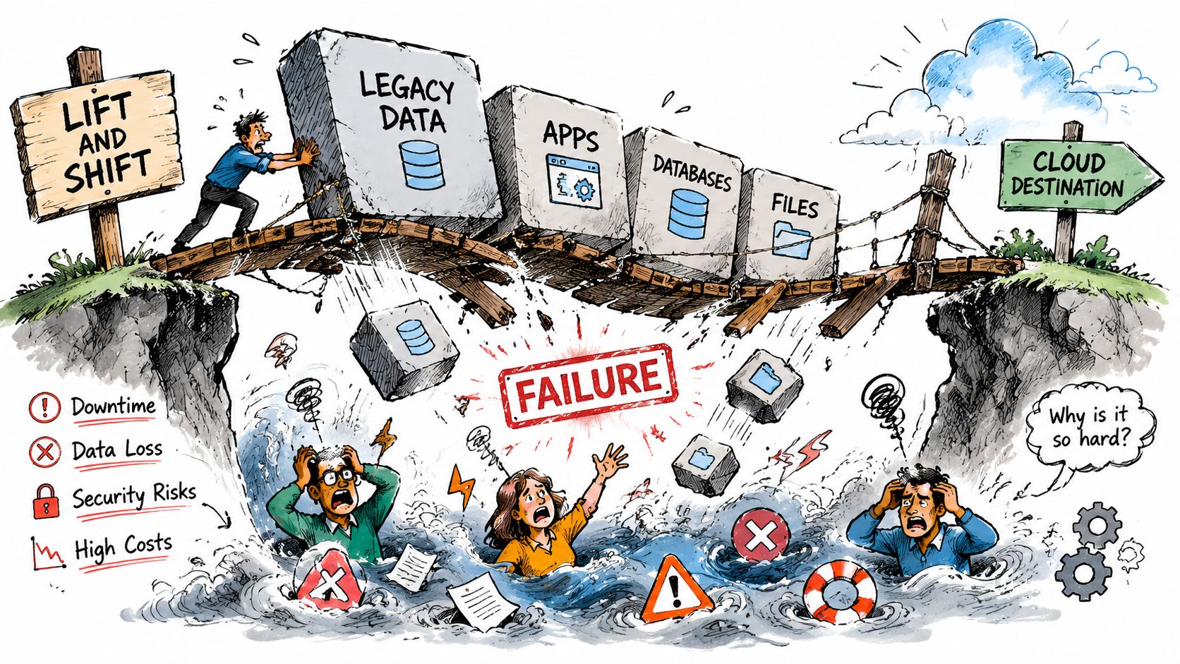
The worst projects start with a sentence architects should shut down immediately: “We already have the reports. We just need to move them.” No. You need to inspect the model logic, source dependencies, refresh patterns, access rules, and ownership before you move anything. If you skip that work, you are not migrating a reporting platform. You are copying old failure into a new service.
That is why simple migrations turn ugly. Old SSAS logic gets dragged into Power BI untouched. Legacy extracts get imported without redesign. SharePoint-connected data moves, then report dependencies break because identifiers, structure, or permissions changed underneath. The report may still open. That does not mean it still means the same thing.
The anti-patterns that keep repeating
These failures are common because teams keep making the same bad assumptions.
- Lift-and-shift modelling. Teams move an old model into Power BI and expect better performance without changing relationships, measures, storage mode, or refresh design.
- Dependency blindness. Reporting owners ignore what sits upstream and downstream of the report, then act surprised when a content migration breaks references or changes behaviour.
- Tool-first planning. Teams pick the migration tool first and ask architecture questions later. That order guarantees rework.
- Inherited access mess. A migrated report estate often republishes years of bad permission decisions at larger scale.
- Semantic drift during rebuilds. Measures get recreated quickly, validation gets rushed, and finance or operations only spot the mismatch after the old platform is gone.
Vendor documentation usually explains what a tool can copy. It says very little about broken semantics, orphaned owners, validation gaps, or the political mess that starts when two “matching” reports stop matching.
Tools help, until architecture catches up with you
SPMT has a use case. ShareGate has a use case. Custom PowerShell and PnP scripting have a use case. The mistake is assuming the tool choice is the strategy.
Use a blunt filter instead:
| Approach | Where it fits | Where it starts to break |
|---|---|---|
| SPMT | Small, simple content moves | Complex permissions, dependency mapping, redesign work |
| ShareGate | More controlled migrations with better visibility | Deep remediation, unusual tenant complexity, reporting logic tied to legacy structures |
| Custom scripting | High-control remediation and staged migration work | Requires specialist design, testing, rollback planning, and operational discipline |
One practical option in the market is Ollo, which focuses on Microsoft 365 architecture, tenant-to-tenant migration, zero-trust redesign, and rescue scenarios rather than simple lift-and-shift moves.
Migrations fail when teams move artefacts and ignore behaviour. Reports are dependencies, identities, semantics, and access rules packaged as files.
The Ollo verdict
Use SPMT for small, low-risk content moves. Use ShareGate when you need tighter migration control. For regulated reporting, cross-tenant complexity, tangled permissions, or fragile Power BI dependencies, bring in people who know how to script, test, validate, and reverse a bad move.
This is the core issue: DIY teams often manage to move content. They fail when they have to preserve reporting behaviour, security intent, and metric integrity under production pressure. Treating that work like routine admin is how you end up with silent data loss, broken executive reporting, and compliance problems that surface after go-live, when the rollback window is already gone.
The Ollo Verdict When to Go DIY and When to Call for Help
DIY is acceptable when the scope is small. One department. Non-critical data. Limited sharing. No regulated reporting. No serious row-level security requirements. No dependency on broader enterprise governance. In that scenario, Power BI is a useful learning tool.
That's not how most businesses use it for long.
The moment your Power BI for business plan includes multiple data sources, enterprise distribution, regulated information, migration from legacy reporting, or board-level KPI reporting, you've crossed into risk territory. At that point, failure won't just produce an ugly dashboard. It can produce stale executive reporting, broken access control, inconsistent metrics, and compliance problems your team then has to explain under pressure.
Your decision should be blunt. If the reporting estate affects finance, healthcare, energy operations, or executive control, don't run it like an enthusiastic side project. Bring in specialists who know where the failures usually start, because they've already cleaned them up before.
Power BI isn't dangerous because it's bad. It's dangerous because it looks simple while hiding architectural, operational, and governance complexity underneath.
If your team is staring at a Power BI rollout, migration, or rescue project and can already see the risk building, talk to Ollo. We help organisations reduce the chance of governance failure, reporting sprawl, and migration damage before those problems become production incidents.